Please be aware of our copyright notice. If you have a good reaon for using a photo from this site ask permission from first - it is frequently given.
London and South Western Railway Luggage Labels
|
| blue | green | grey | orange | pink | white | yellow |
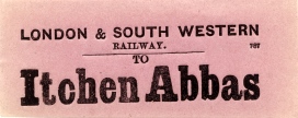
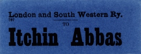
Two splendid examples of the bright colours and different printing formats of this genre. Note the different headings and the spelling aberration in the name.
The dimensions of these two labels are 3.8" x 1.5" (97 x 38mm in modern speak).
.The grey variety, which is a distinct grey as opposed to faded white, was used for only four destinations and disappeared from the assortment very quickly whilst the orange was reserved for a small selection of LBSCR destinations only and they are highly prized by collectors although a couple of them are generally available. There is, however, one very odd exception within the orange labels (Addlestone) which will be mentioned on the appropriate page.
At some time in the evolution of the LSWR it was decided to dispense with the colour coding principle and (nearly) all labels produced from about 1888 were printed on white paper. Despite the subsequent apparent uniformity there is still a great deal to interest the serious collector. And why that word 'nearly'? Well, concurrently with the production of the standardised white labels the Isle of Wight destinations were blessed with their own unique shade of mauve paper and the majority of those are highly prized in the LSWR label collecting community.
At some point prior to the total change to white labels there seems to have been a general shift away from the colour coding scheme and many of the more brightly adorned labels were superseded by what can best be described as a corporately defined blue. The use of blue paper begs the question: why on earth was DARK blue used because black print on dark blue paper is practically illegible in anything less than bright daylight? They look great in a collection but must have been a nightmare to deal with on a day-to-day basis.
One feature common to all LSWR luggage labels is the application of the stock number '787' except on the rare occasions where the printer has accidentally forgotten to typeset it. That number might not appear to the uninitiated to be significant but it becomes so. The really enduring feature of the LSWR basic design is that it was adopted by the Southern Railway as its standard for luggage labels right through to nationalisation in 1947 and all SR labels also carried that code. Interestingly, the S&DJR, post-grouping, also adopted the same basic design complete with the stock number but for only a short period.
Unlike all of its immediate neighbours the LSWR didn't apply a printed station of origin to its labels until quite a late stage in their evolutionary cycle. Indeed, the neighbours to the north and west had abandoned the practice years before the LSWR even started. Even then only Waterloo, Ilfracombe and Bournemouth West were definite recipients thereof although it is believed that Southampton West also had them as a single example has survived.
The LSWR assortment of label types falls into a neat set of categories based on different formatting of titles, formatting of the destination (font and style) and the inclusion or otherwise of a 'from' line. Paper colour, with the exception of labels to the Isle of Wight, is not a categorising factor.
The LSWR also excelled itself in one other respect: it produced labels for some destinations that had no station. The examples that immediately spring to mind Alum Bay and Totland Bay. It's probable that there was some sort of established road connection to those destinations provided by the appropriate railway as the production of these label destinations continued under Southern auspices for a number of years.
This page was last updated 23 November 2007
Index to Labels pages
![]()