Please be aware of our copyright notice. If you have a good reaon for using a photo from this site ask permission from first - it is frequently given.
The Coloured Varieties
These fascinating labels fall neatly into five clearly definable types which, not surprisingly, are called Types 1 thru' 5. They are simple to identify as they are all based on the style of the railway's name in the title. Click on the images below to find out what the characteristics are for any given label type.
Type 1 ![]()
Type 2 ![]()
Type 3 ![]()
Type 4 ![]()
Type 5 ![]()
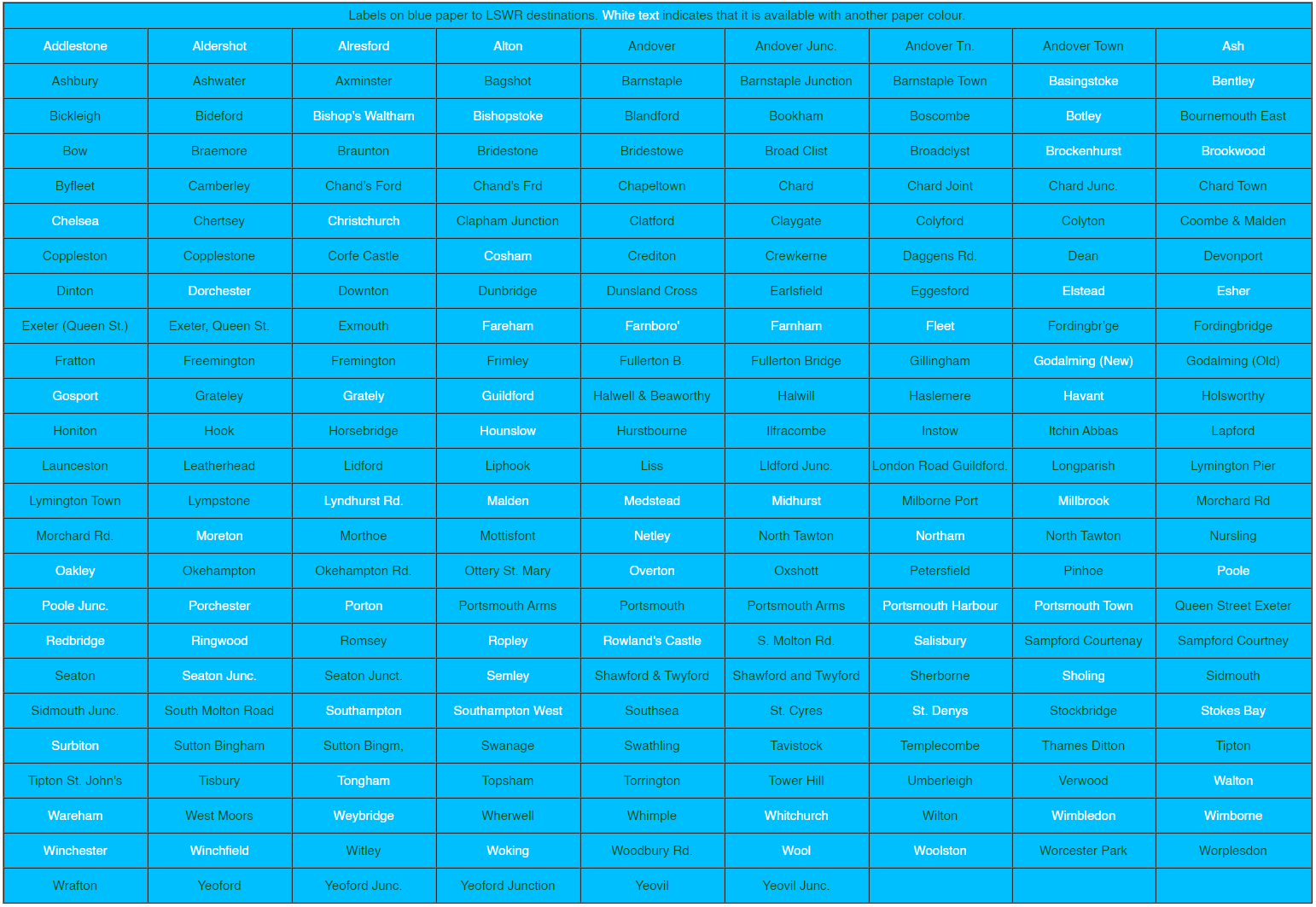
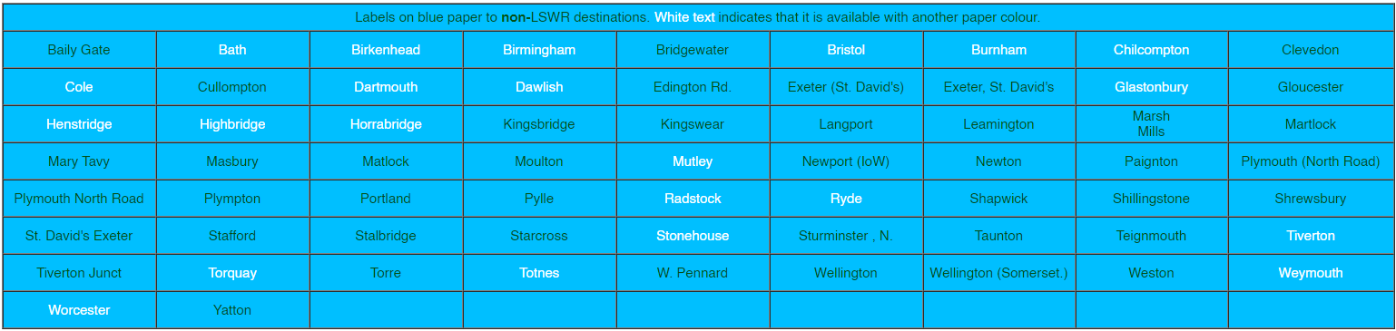
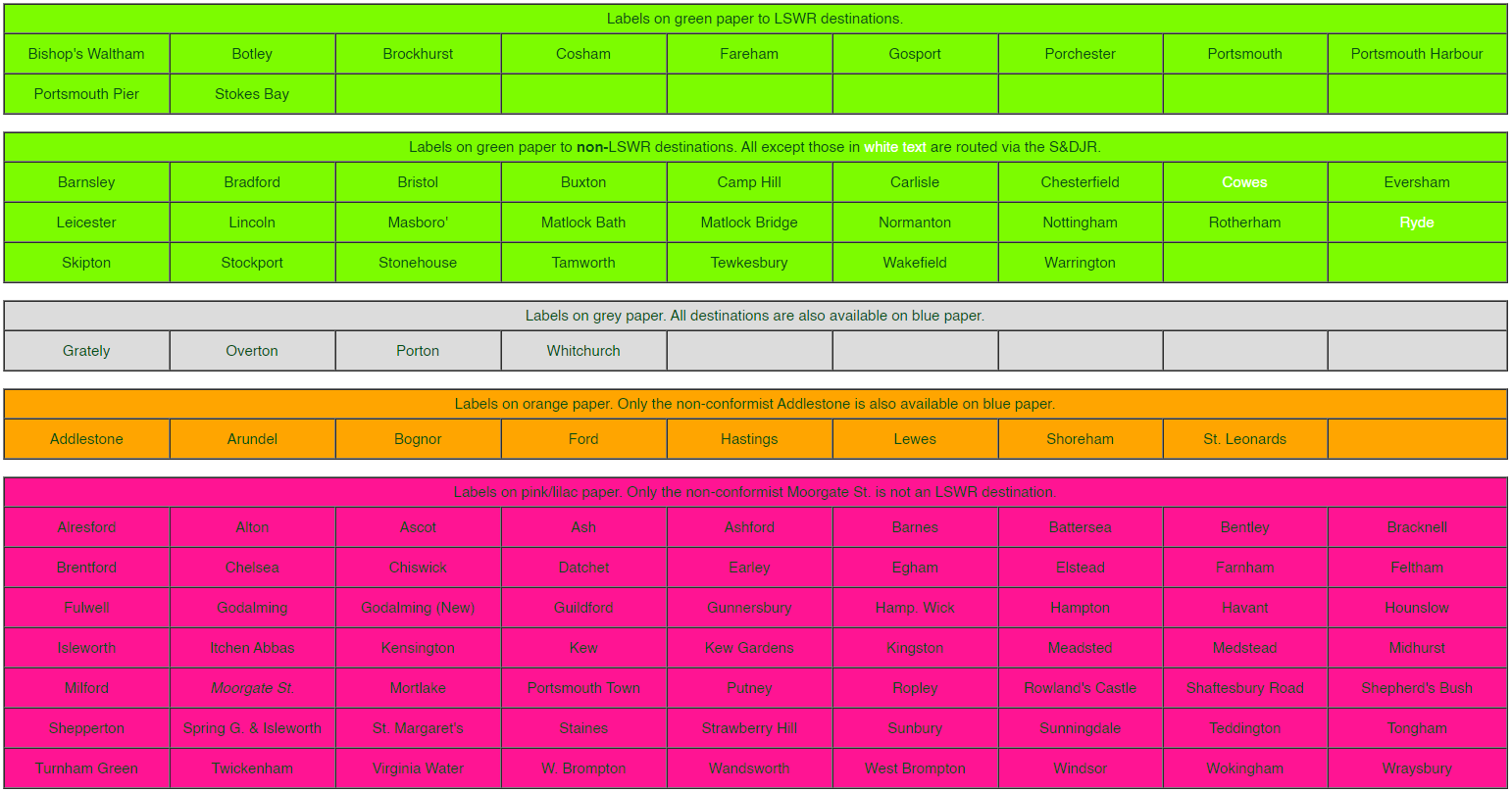
Table of Colours
The following tables attempt to categorise the known destinations according to colour of label. Even a cursory glance over it will show with reasonable clarity the LSWR's policy of coding routes by colour. It is worth noting that 'foreign' destinations, for a time, were produced on yellow paper but many were later reprinted on blue stock.
The category labelled 'pink' is a generalisation as the hue varies from bright pink across that part of the spectrum to lilac and even includes at least one example that isn't far short of bright red.. It is mentioned elsewhere that Isle of Wight labels were printed on mauve paper and that they are prone to severe desiccation and this 'pink' category can suffer the same fate whereas most of the gamut of the coloured labels have stood the test of time reasonably well.
For the benefit of readers who have the misfortune to be afflicted with colour deficient vision, the colour is stated in the header line for each block of data.
The number of listed variations totals in excess of 700 but that isn't the complete story as no account is taken of the fact that many of the listed Type 4's are available in two or more very different fonts. Many listed items have examples with the '787' on the opposite side to the norm and there are also a few variations within Types 2 & 4 where the conjunction (and or ampersand) are the opposite of the standard for that type. Also to be taken into account is that previously unknown examples still continue to surface and even the author's own limited collection contains fourteen such which, actually, is nearly all of them.
The pervious version of these colour tables skimped a little on detail but the new versions shown below included all variations of spelling and punctuation. The only addition to reality is that (IoW) has been appended to some of the island's station names.
Coloured Labels - Type 1
With just a couple of notable exceptions, all LSWR labels are basically the same shape with some slight differences in proportions. The coloured labels are subdivided into four categories which are distinguished by the different formats of the company title. The earliest type, referred to amongst collectors as L91/1 but as Column (or Type) 1 in the RPS guide, has a very neat appearance compared with its successors.


Note the uniformity of the railway title which was never improved upon in the later styles and is the only label heading style that utilises the full company name. The heading never varies on this type of label which is far from the case with the later types.
The '787' code was on (nearly) all LSWR labels from the beginning of label production and this type is constant in that respect. It should always be on the right side and enclosed in brackets on this type but many examples are missing one or both brackets.
The destination of Colyton helps us to narrow down the production date as it was opened in 1860 and renamed Seaton Junction in 1868/9.
The destination of Arundel is one of the few labels to be printed on what is termed 'orange' paper but which actually varies between buff and a fairly strong orange. With a single exception LBSCR coastal destinations are the only ones which were printed on this paper.

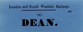
The font used for this earliest type is fairly consistent across the surviving examples but is vastly different between lower and upper case examples and there can be a variant within the latter. The bulk of the destinations is followed by a somewhat heavy rendering of a full stop. That would be natural in this example as it's an abbreviation and what a strange one that is!
The example to DEAN illustrates the totally different font that was applied to, seemingly, only this destination. It also differs in having a round instead of a square full stop. The differences don’t end there as the paper is of a better quality than other examples within this genre and the hue, difficult to illustrate clearly, is nearer turquoise than blue.
It has been mentioned on the previous page that grey paper was used for only four destinations and there seems to have been little point in route-coding Overton, Whitchurch, Grately and Porton whilst applying a different colour (blue) to Andover which is plumb in the middle of them! It is only on this earliest type that grey is to be found and those stations became part of the 'blue' route thenceforth. As grey was used but subsequently abandoned then this type is the only one that makes use of the full range of colours.
Coloured Labels - Type 2
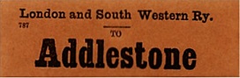
This type is characterised by its unusual heading which is spread over two lines and it is consistent throughout the entire range. It also sees the introduction of an ampersand instead of the word 'and' in the title.
All the examples in the author's collection display the '787' code on the right-hand side and none of them is enclosed in brackets.
This type of label sees the introduction of a some new features to the assortment:
- 'foreign' destinations
- mixed case print
- destination printed on two lines
- in the case of 'Wareham', a subtler font


The Queen Street label is matched by a St. David's version but, as will be seen with the Type 4 labels, they eventually had the formatting reversed with the 'Exeter' dominating.
The Wareham label, yellow because it is on the Southampton to Weymouth line, has a 'WHIMPLE' overstamp and many LSWR labels display this characteristic. The font used on this label is often referred to as the spidery or thin font. There is more information on that esoteric aspect in the section on the Type 4 labels.
Note also that the GWR destination is on a blue label whereas the norm, perhaps later in the production cycle, for 'foreign' destinations, became yellow with one or two notable exceptions.
Coloured Labels - Type 3
 This type is by far the hardest to track down as relatively few were produced. This could be because the design and production quality is quite poor leading to curtailed further development.
This example to Esher, far from being the worst, exhibits a typical lack of quality control insofar as the '787' is missing entirely and there's a spurious vertical black line to the right of the destination.


The Grateley examples exhibit two other characteristics of this type with '787' printed both left and right as well as indecision over whether to use 'and' or an ampersand in the title.
Although not illustrated, there is a tendency for the title to be printed in a somewhat less than straight line.
Coloured Labels - Type 4
It is within Type 4 that the bulk of the coloured labels is to be found. There is a profound change of style in the title's presentation and the labels are generally well presented.
The title has reverted to mixed case but in larger letters than the Type 1s. In just a few examples the 'and' has been replaced with an ampersand.
For the first time part of the title is in the form of an abbreviation: Ry. instead of Railway. This heading format, in its entirety, will remain the standard for the remainder of the LSWR's reign and will be applied to all the white labels as well as the mauve ones for the Isle of Wight destinations.
The '787' code is also something of a lottery. The norm is that it is printed on the left-hand side but there are many examples, even for the same destination, where it is printed on the right with a few missing altogether.
It is in the Type 4s that the greatest variety of colour variations and fonts occur although, as stated elsewhere, grey had been removed from the array of colours before the era of this type dawned.
This type of label also sees the introduction of a second line which is used to accomodate a 'Via' station or stations.
Illustrated below are some of the many variations to be found in a collection of this type of label.
_pink.jpg)
_lilac.jpg)
The vast difference in the range of hues covered by the generic name
'pink' is well displayed here and also two of the assortment of fonts.
Note the 'carefully applied' overstamps. In case you can't
make it out, the upside down one is YEOFORD JC.
_green.jpg)
_green.jpg)
_green.jpg)
_green.jpg)
Again, for one destination we see almost the full panoply of paper colour, stock No. position, both 'and' and ampersand in the title, and font style with the added bonus of origin station overstamps.
 Mention has been made elsewhere about this oddity. All other
orange labels relate to destinations on the LBSCR's coast line. This one is
surrounded by destinations that were printed only on blue paper and this one is
no exception as it, too, is available in blue.
Mention has been made elsewhere about this oddity. All other
orange labels relate to destinations on the LBSCR's coast line. This one is
surrounded by destinations that were printed only on blue paper and this one is
no exception as it, too, is available in blue.
 The introduction of a 'Via' line was limited to just
three routes:
The introduction of a 'Via' line was limited to just
three routes:
- MSWJR destinations on yellow paper Via Andover Junction
- Five GWR destinations on blue paper Via Basingstoke
- Midland Railway destinations on green paper Via the S&DJR
 Not the misspelt Evesham. This isn't the only 'Via'
to be found on these labels. Others are:
Not the misspelt Evesham. This isn't the only 'Via'
to be found on these labels. Others are:
- Via Evercreech
- Via Templecombe
 The other 'Via Basingstoke' examples are:
- Birmingham
- Leamington
- Shrewsbury
- Stafford
There are one or two more oddities within this label type:
- a blue label to Bristol via Templecombe
- NLR destinations on the North London Railway - yellow labels and all, apparently, emanating from Shepperton.
- a yellow example to Penzance - the only GWR station west of Plymouth to be so honoured
- a green label to Ryde - the only green label to an Isle of Wight destination.
- yellow labels to TULSE HILL and Brighton.
- A blue label to Streatham (but not actually seen by the author)
Coloured Labels - Type 5
There is a problem with Type 5 designation: does it really exist? Even the RPS guide casts doubt on its true position in the scheme of things as the labels contained therein are described as 'transitionals', a term much used by luggage label collectors to cover anything that doesn't fit a perceived pattern. So, why the confusion?
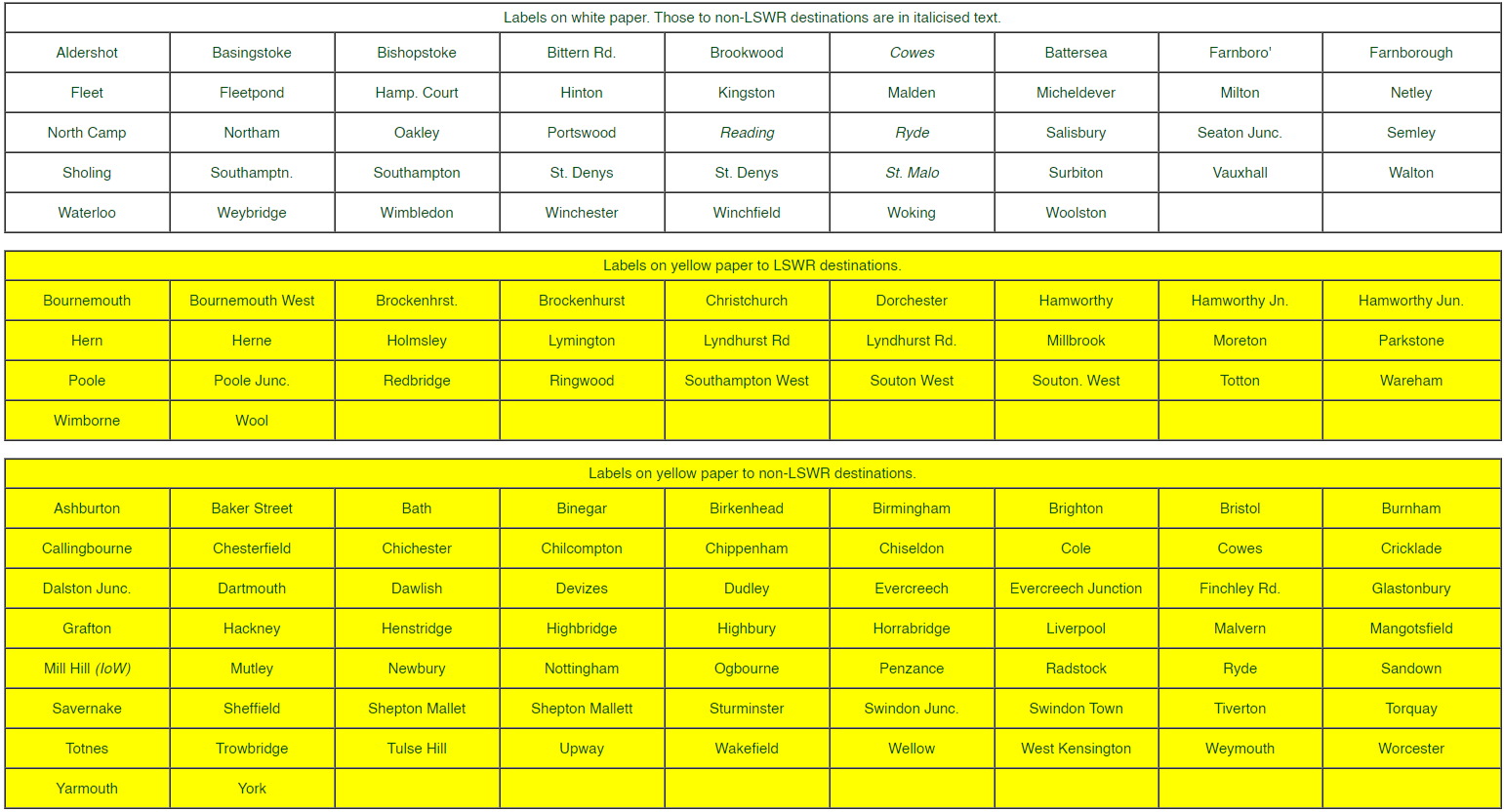
As can be seen from the table of colours there was a concerted attempt by the LSWR to colour code its labels according to route and there was, indeed, a white route which was the erstwhile London and Southampton Railway but note, from the table of colours, that there were a few destinations that fell outside that narrow remit. White labels are known within Types 1, 2 & 3 for most of the stations on that line which is to be expected. Unfortunately, most of them were superseded by blue labels within the Type 4 period which rather negated the application of white labels to this route. However, white labels for the relevant L&SR stations do exist (and in some quantity) for most of those stations printed on blue paper and in identical style.
Some collectors do attempt to categorise these labels separately but others either link them with the Type 4s or simply lump them together with the other white labels which are dealt with separately within this opus. But see the illustrations below and compare them with the other white labels to understand why there is confusion in the ranks.

The print style (font) is clearly of an early style and this
station is on the L&SR route but there is also a blue example with a much
more modern looking font.

The two example displayed here exemplify the collectors' dilemma. Neither lies on a white route and yet they are clearly printed in a style that predates the bulk of the white labels.
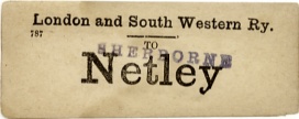
The example to Netley is actually meant to be white but has discoloured with age.
The Seaton Junc. is printed on vividly white paper and is identical to a blue counterpart. So, is it a white label within the colours category or does it belong to the conglomeration of white labels described in a separate section?
This author keeps them as white labels within Type 4 and selects them on the basis of print style and paper quality. There is a distinctly different 'feel' with these older style labels that sets them apart. Another key feature is the use of lower case as almost all the later white labels without a From line are in upper case.
Return to Coloured Labels Index
This page was last updated 7 July 2007
Index to Labels pages
![]()